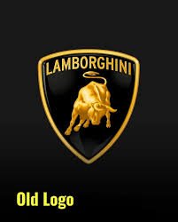
Lamborghini unveiled their new logo on 28th March, revamping it as a part of their identity uphaul. The renowned luxury car company, Lamborghini, has recently undergone a significant change by updating its logo after a span of two decades. This update is a pivotal aspect of the brand’s strategic transformation initiative, known as ‘Direzione Cor Tauri’.

Why was this done?
Italian automaker Lamborghini has introduced a revamped brand identity, featuring a simplified and flattened logo, as part of a wider “transformation process” focused on sustainability and reducing carbon emissions.
The updated logo maintains the iconic bull positioned at the center of a shield, but with streamlined details, creating a silhouette effect. Additionally, the typography has been refined, featuring a broader and thinner typeface.
According to the company, the new logo is characterized by a broader Lamborghini typeface and minimalist yet striking colors. This redesign aligns with a new strategy aimed at ensuring the brand’s visual elements better embody its mission values of being ‘brave’, ‘unexpected’, and ‘authentic’. This transformation was mainly done to keep in mind their mission ‘Driving Beyond Humans’.
The new logo of Lamborghini was launched across all official platforms, characterized by a broader typeface and minimalist yet bold colors. The primary hues of black and white reaffirm the brand’s identity, while yellow and gold serve as accent colors. This updated logo will be integrated into the company’s identity and future car designs. Notably, the iconic bull has undergone a significant transformation, now standing alone on digital platforms for increased prominence.
“In a rapidly changing context, Automobile Lamborghini looks to the future with a redesigned logo that embodies innovation and determination. It’s a strategic change that perfectly complements the holistic shift outlined by the Direzione Cor Tauri program—marking a new phase in the company’s journey,” said the company in its official press release.
Response on the internet
However, the response on the internet has been mixed, with some critics expressing disappointment in the oversimplified design, perceiving it as cheaper and detracting from the brand’s premium image. Critics have also questioned the decision to change a logo that many felt was already perfect, emphasizing the importance of consumer feedback in such decisions.
“I hate oversimplified logos man,” remarked one user, while another wrote, “Is it for a cheaper Lamborghini line? Because it looks cheap.” Another comment stated, “If it ain’t broken, don’t fix it,” with yet another adding, “Whatever agency did this without getting consumer feedback really failed.”
History behind the logo
As per the company, the inception of the original logo dates back to founder Ferruccio Lamborghini’s fascination with bullfighting.
Since the company’s establishment in the 1960s, the logo has prominently showcased the Miura bull, renowned for its fierce and aggressive nature. The Lamborghini logo, designed as a shield with black and gold accents, features the company name above an image of a bull. This choice symbolizes the founder’s birth under the Taurus zodiac sign and his passion for bullfighting. The bull embodies qualities like strength and speed, aligning with the company’s ethos of producing powerful and dominant cars.

The Lamborghini logo’s color scheme holds symbolic significance, comprising black and various shades of gold. Black signifies power, authority, elegance, and simplicity. Gold, chosen to represent luxury, is commonly associated with opulence. The logo’s gold tones create a three-dimensional effect, enhancing the bull design’s contours and features.
Initially, Ferruccio Lamborghini faced criticism for the logo’s resemblance to Ferrari’s emblem, reflecting his competitive spirit. Both logos feature a shield shape, gold and black colors, and an animal motif, although Ferrari’s emblem depicts a horse. Despite the initial controversy, the Lamborghini logo has become an iconic symbol of luxury and power in the automotive industry.
So, it isn’t just now that the company is facing criticism on its rebranding but also occurred during the initial drop of the logo. Other brands which underwent minimal changes include Pepsi, KIA, Volkswagen, Volvo and Audi. They made the news too for their change in logo.


Comments 2